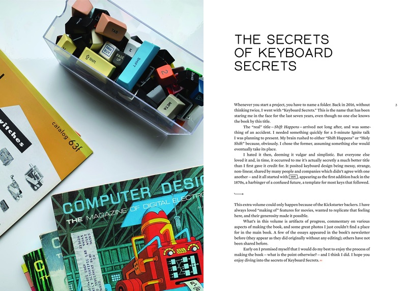
Author’s commentary
If the book’s extras volume is akin to DVD extras, this is a version of “director’s commentary” – a perhaps too obsessive list of various details and follow ups to certain design decisions, photos, and other parts of the book.
Volume 1
Cover & Slipcase
The story of the evolution of the covers is in my newsletter,
and also to some extent in the extras volume on page 34. The symbols used on the spines come from various keys throughout history (everything
except Shift). In the first volume, the symbols (drawn by me) originated on typewriters and
other electromechanical keyboards. In the second volume, all the symbols come from computer keyboards.
Endpapers
The endpapers showcase eight Shift keys from important keyboards – this time
with their legends intact.
1
The book starts with an intentional “cold open,” without any front matter or title. The rejected earlier versions of this opening chapter can be read in the extras volume, on pages 36 and 52.
15
The titles and page numbers in the book are typeset in Gorton, a font known
from computer (and typewriter) keyboards, which has been resurrected for
this book. Read more about Gorton’s history in the specimen for Gorton Perfected, the resurrected font,
and also see the extras volume on page 10.
20-21
There is no remaining trace of the actual device made by C. Latham Sholes, so I
hired a 3D modeller to recreate it based on drawings and one existing replica.
This reproduction is presented in actual size, so you can imagine pressing
this historic key; see also pages 20, 115,
117, 223, 294,
295, 296, 297, 298,
308, 617, 626,
734, 857, 930,
986, 987, 992,
993, 1011, 1017,
1018, 1020, 1025,
1033, and 1034.

22
The historical photos in the book are on beige background, which slowly gets replaced
by gray as the book moves towards modernity.
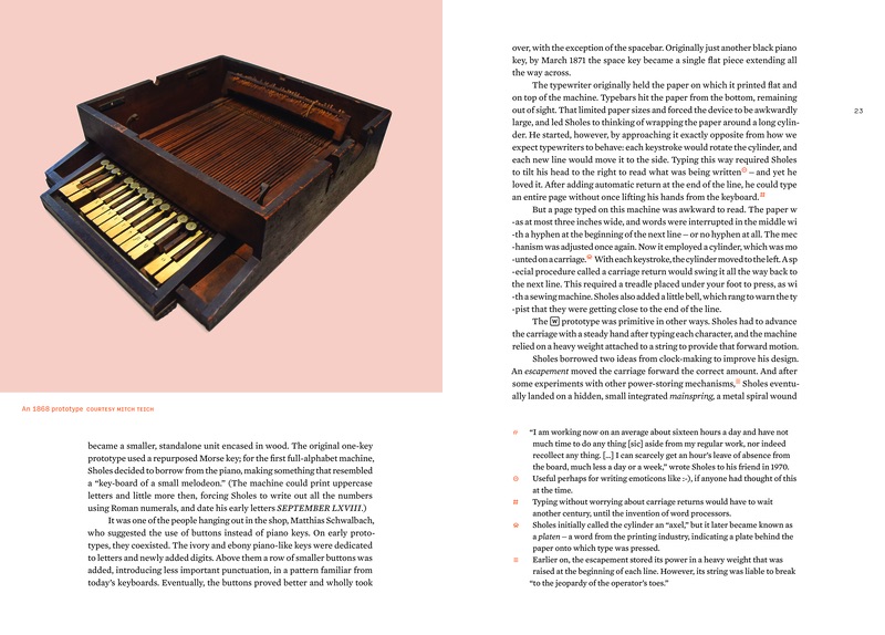
23
One paragraph on this page simulates text wrapping and hyphenation
on an early typewriter.
26-27
Like with many spreads in the book, I tried the direction the people or objects are facing to be consistent: one direction, toward the edges, or – like here – toward the spine.

38
This is one of the five “most important keyboard” spreads. See also: page 94
(Underwood №5), page 408 (IBM Selectric), page 664 (IBM Model M), page
996 (iPhone), and… page 1132 as a bonus (IBM Correcting Selectric II).
See also: extras volume, page 50.

51
The section break and footnote symbols come from various keys throughout history. In this
volume, all the symbols originate on typewriters and other electromechanical
keyboards. In the second volume, all the symbols come from computer keyboards.
The symbols are also used on the spines of all volumes.

52-53
The typewriters on the left-hand side are both what we would call “ortholinear,” and a little bit a foreshadowing for 100 years later.
55
The !!1 typo appearing on this page is a Shift joke looking forward a hundred
years.
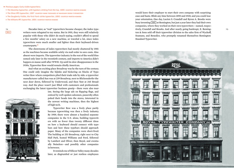
74-75
The buildings are meant to be to scale… with one another, of course.
82-83
These photos were restored using an interesting scientific technique I described in one of the newsletters.

106
You can see how I took the photo of one of these books on page 46 in the extras volume.

108-109
The vinyl record on the left was deliberately juxtaposed with the audio cassette on the right.
117
The tricolon symbol used for secondary quotation marks in this book is a nod to
the mysterious tricolon key on the first Sholes & Glidden typewriter (see page 1076).

118
One of the few examples of me deliberately showing a dirty keyboard, to remind people how dirty and nasty keyboards can be!
129
The first of a few examples of “mysteries” – the next spread revealing the answer to visual questions from this one.
See also: page 811, 831, and 1064.

132
This address on this ad harkens back to the Broadway, New York story in the earlier chapter.
135
This is an actual scan from a Royal internal magazine talking about alignment testing.

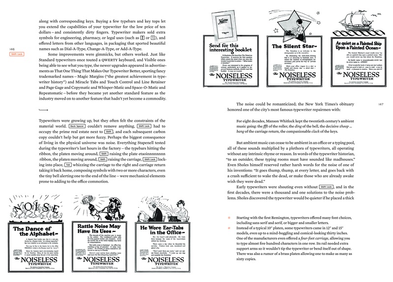
146
Etaoin shrdlus (see page 267) have been inserted on pages
146, 262,
301, and 1128.

154
Typesetting here simulates a misadjusted typewriter where the red
ribbon shows at the top of each line.
160-163
Acknowledgements usually go to the beginning of the book, but it was important to me not to have any front matter and not lose any momentum before jumping into the story. So I reimagined acknowlegements as a showcase of various styles of typewriting – from 19th century, to almost in the computer era. All of these have been done using a program I wrote to take scans of typewritten letters and assemble them into a typewritten page.
182-183
The style of these visuals has been inspired by an article in Computers And Automation in 1972.

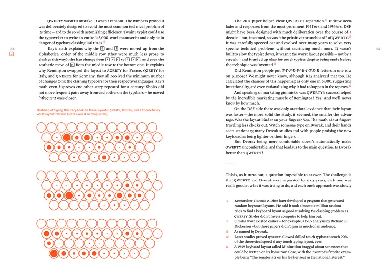
186
The style of these visuals has been inspired by an old Polish book, which you can see on page 967.
192
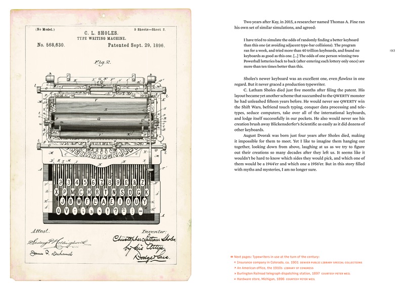
I specifically wanted to avoid showing drawings and patent drawings for machines that actually existed – I wanted them to be seen as they were.
However, in this case, and also on pages 178-9, it’s the patents that actually matter, as this machine never made it to production, and the only remaining photo of it (see
page 550) doesn’t show the layout in more detail.
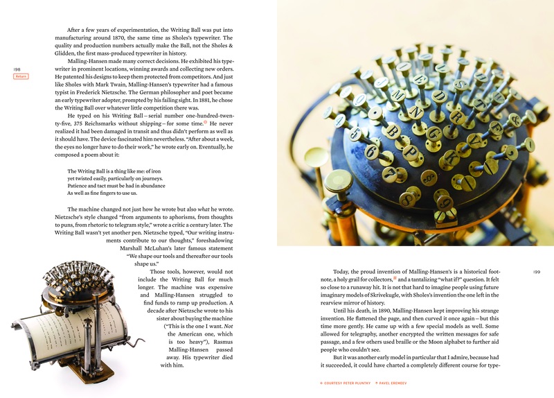
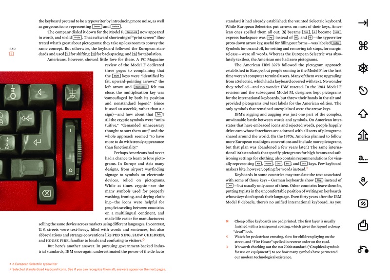
198
One of few examples of being able to flip two pages to see a machine in
two different states. See also: page 483, 830,
856, 873, and 1128.
212
Like in a few other places, it was important to me not to limit the scope to just American output – hence one of these ads being from France.

232
You can see how I took the photo of one of these books on page 47 in the extras volume.
239
This first keypad page is matched by the second one much later in the book, on page 985.
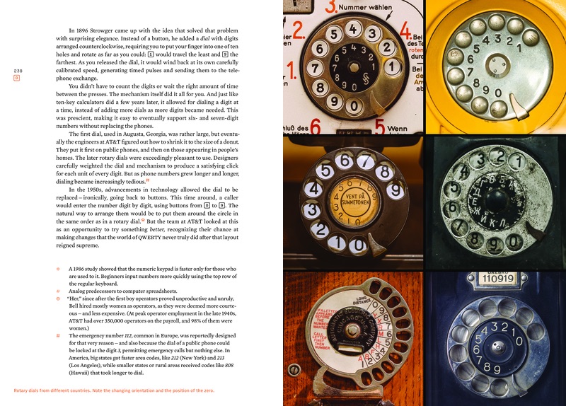
242
While this image has circulated on the web for many years, this is a brand new scan in a much higher quality from the original, hard-to-find source.

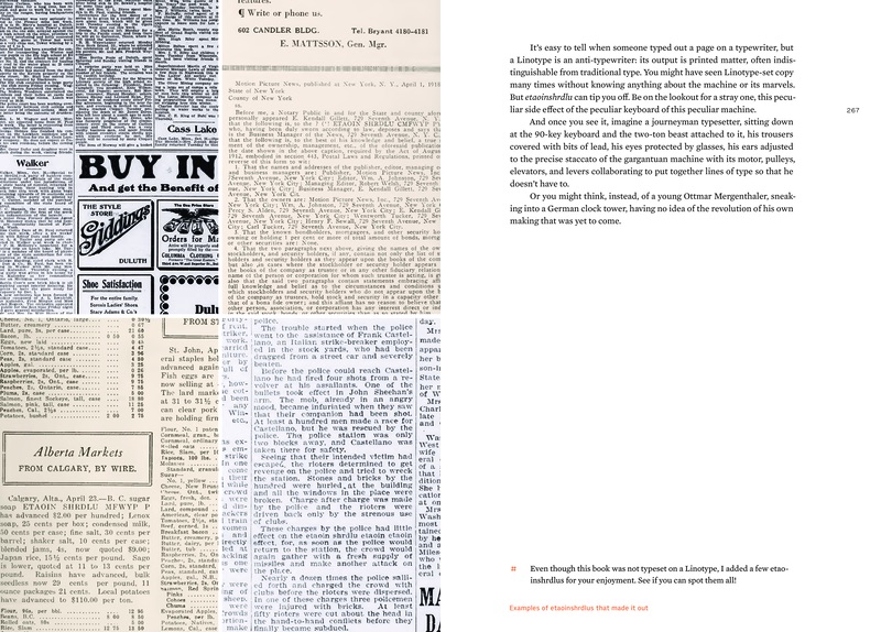
266
This spread of etaoinshrdlus is matched by another spread on page 1198.
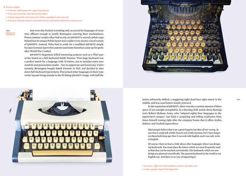
281
This was among the hardest photos to find in the book.
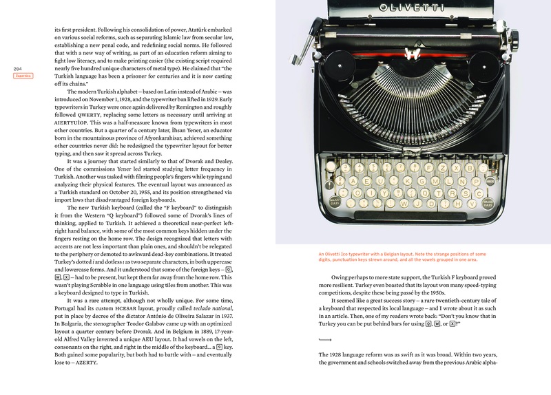
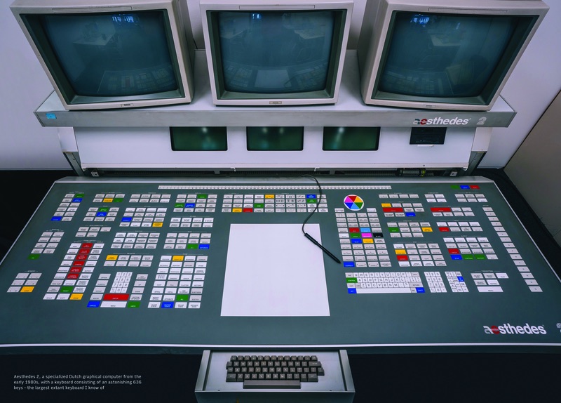
285
A work-in-progress photo of this keyboard is in the extras volume, page 51.
289
The last diagram here foreshadows an upcoming chapter about Chinese typewriters.

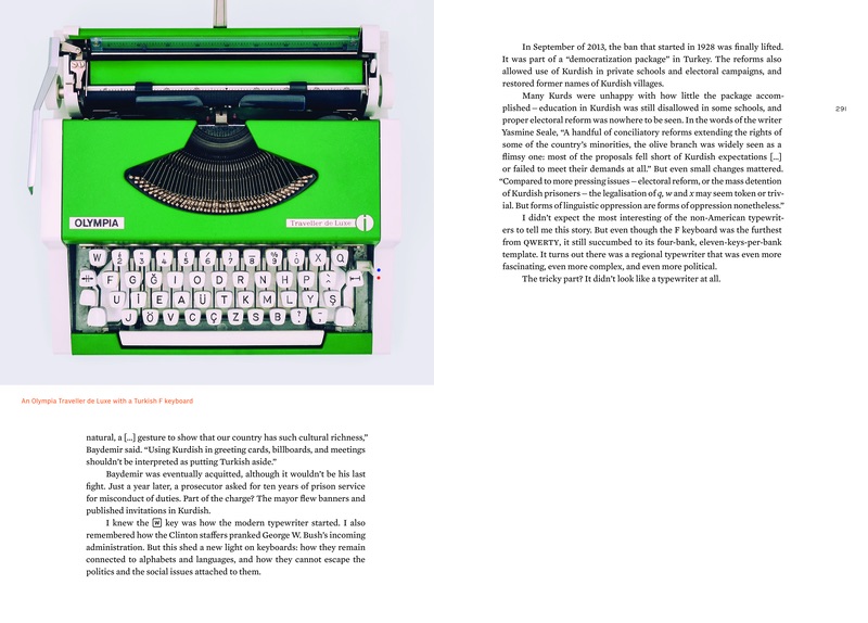
290
This is my first typewriter, which I got for the 2014 article What I learned about languages just by looking at a Turkish typewriter, which is referred to in this chapter.
292
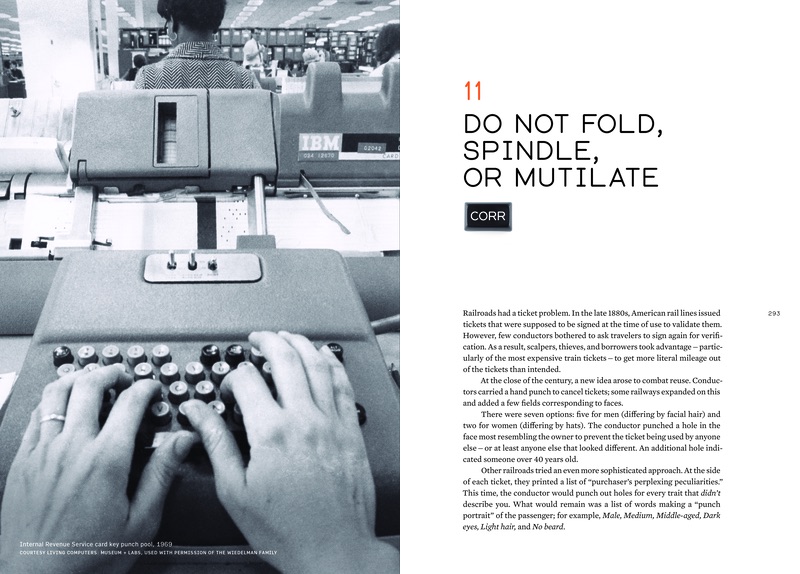
I fell in love with this photo after seeing it on the wall of the Living
Computers museum in Seattle – it’s a very rare first-person photo of someone typing.
The kind people at the museum put me in touch with the owners of the photo.
294-295
These required years of eBay searches, and I am pretty sure I made enemies in some rail ticket collectors, with whom I got into bidding prices.

302-305
This was originally just a few photos, but I kept finding new ones that told the story of the evolution of the key punches really well. Please note the visual consistency: women always look toward the spine.

302
I requested the Library of Congress to digitize this bottom photo of a very rare keyboard in the process of making the book.
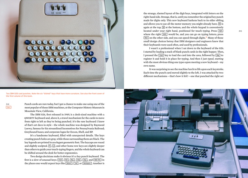
314
The “cream” version of IBM 026 is much more rare, and I was happy to find it in Spain and take a picture of it.
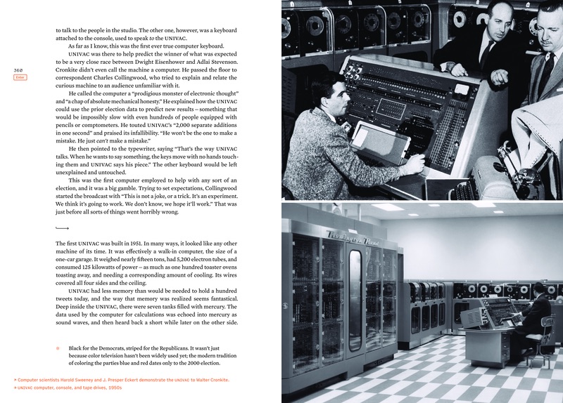
360
Note the easter egg – slashed zeros – in page numbers of this chapter. The irony here that early computer output and keyboards sometimes used regular zeroes and slashed or deformed the letter O, deeming it less important.
(Compare: page 387, page 423, page 500, page 507, page 531, and others.)
372-375
Please note the consistency of people always looking away from the spine.
381
I wrote about the story of chasing the author of the top photo in my newsletter or on page 42 in the extras volume.
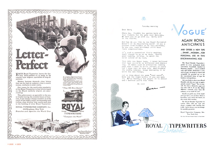
397
I like the juxtaposition of the sweaters on this page and the woman wearing a sweater on page 303.

400
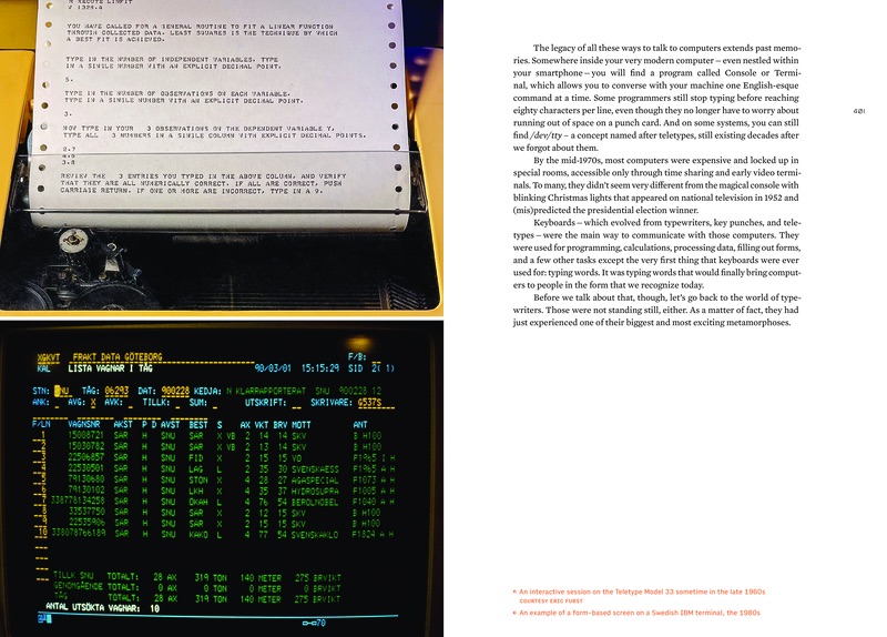
After not being able to find any good photo of a teletype being used to communicate with the computer, I was happy to commission a photo from Eric Furst, where we recreated an output of a 1960s program.
410-411
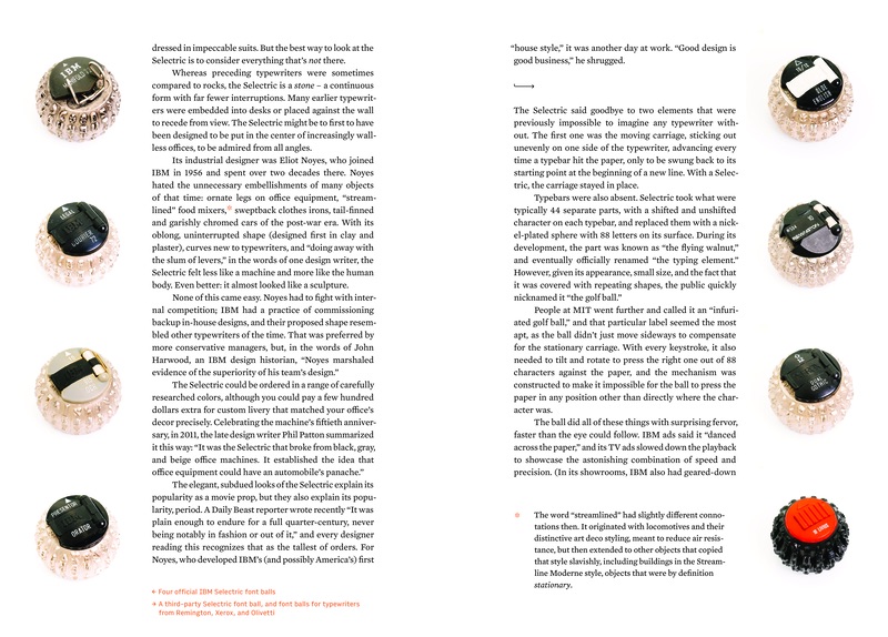
These are all from my collection – I have never seen a juxtaposition of various styles of IBM font balls, nor a small collection of the competitors’ balls.
414-415
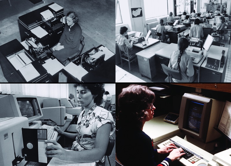
Perhaps one of the spreads that was the hardest to find photos for. The photographs of offices with Selectrics are not labeled “photos of offices with Selectrics” – this required sifting through many offices photos from many decades.

416
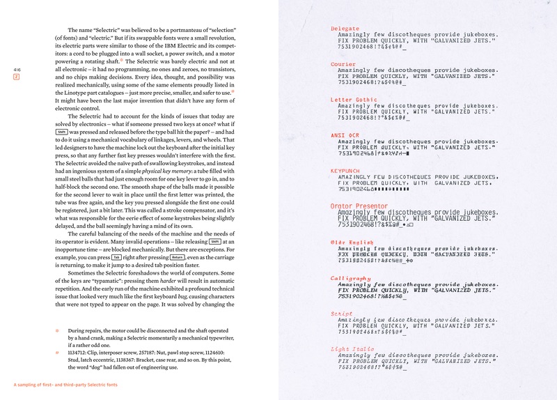
The last footnote here harkens back to Linotype and page 251 in particular.
440-441
I colorized the left photo to match the right photo for more consistency. The right photo was contributed by
Matthew Kirschenbaum, the author of the excellent book Track Changes: A Literary History of Word Processing.

469
This excellent typewriter identification photo was found almost by accident, just by perusing (again) the wonderful Hungarian photo archive Fortepan.

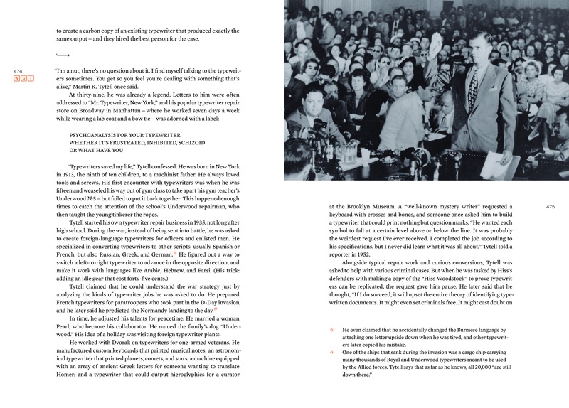
474
I wrote more about Martin K. Tytell and Peter Tytell (including my conversation with
him) in
my newsletter or on page 88 in the extras volume.
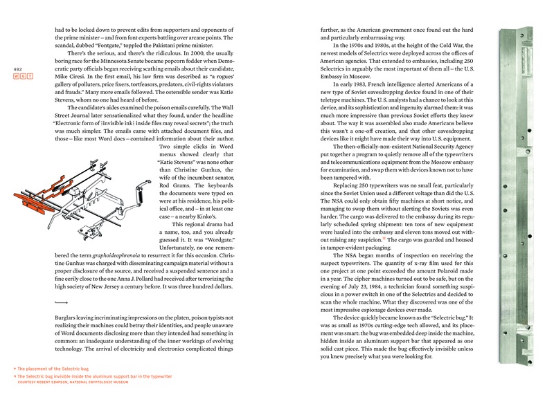
483
These high quality photos of the Selectric bug were taken from someone at the National Cryptologic Museum just for this book.
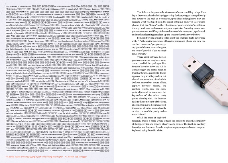
486
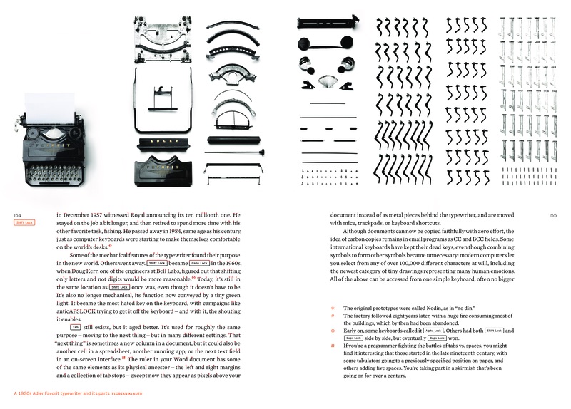
This is a genuine output of me keylogging myself when writing this chapter about keylogging.
There was originally a passage in the chapter about it with some observations, but I had to remove it for brevity.
Some traces of the experiment are still out there on Twitter.
500
It was import for me to show devices in use in general, and any electric/electronic device
with its screen on in particular (for a perfect example, see page 897). In moments
where it wasn’t possible, I recreated
the screen with the utmost care to for its appearance. All of screens prepared in
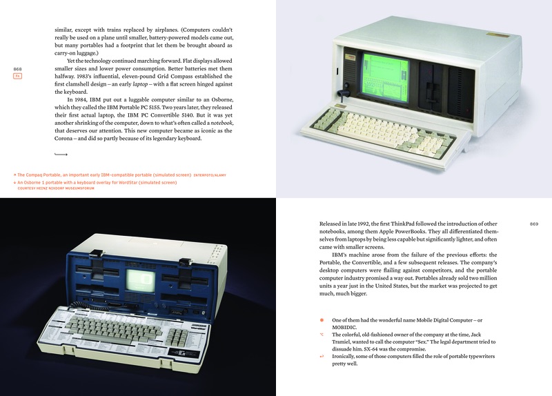
post production are labeled “simulated screen.” See also: pages 641, 682, 716, 719, 738, 794, 807, 853, 868, 869,
955, 992, 993, 1024, and 1025.
514-515
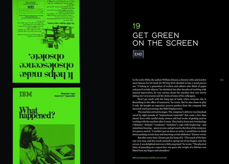
This spread is deliberately put on black with green accents as an easter egg.
533
The photo at the top was particularly interesting to discuss with a little crowd over at Mastodon.
538
Was very happy to include a letter from Tomasz Lem (with his permission), writing about his father Stanisław Lem, my favourite writer.
596
I collected too many interesting photos of people typing on various keyboards, all facing right.
The overflow from this section can be found in the extras volume (pages 26-31).

603
This photo was a wonderful result of me asking on Twitter about photographs of people with their first computers.
Volume 2
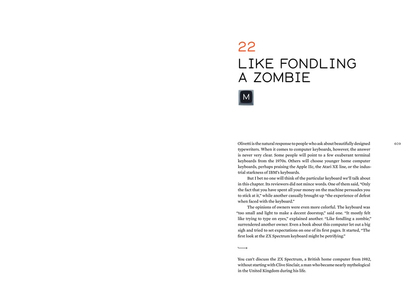
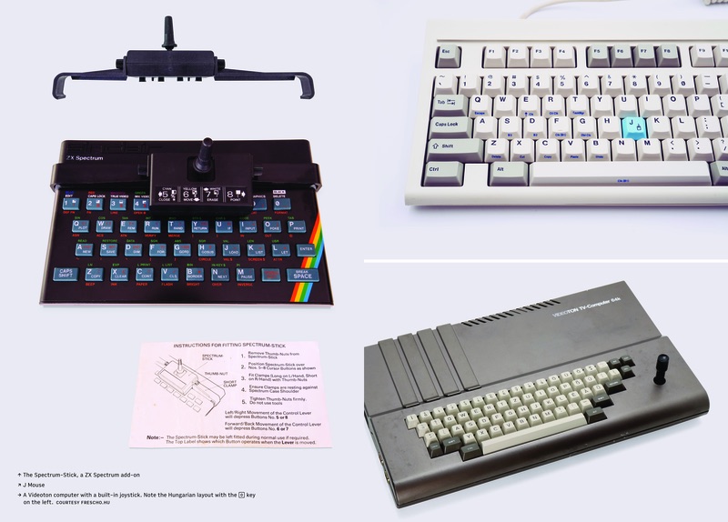
609
The first volume ends on Olivetti (widely considered a maker of the most
beautiful typewriters and computers). The second resumes on ZX
Spectrum (widely considered to be the one of the worst keyboards ever made).
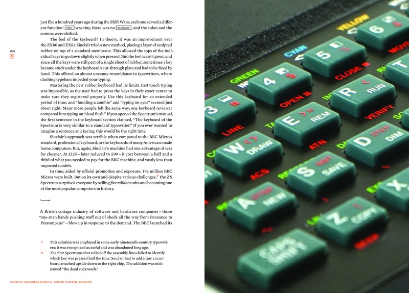
619
This photograph was a happy accident. I randomly zoomed in on a photo I received from Mutant Caterpillar Games, and I realized it’s high enough quality that it could be shown this way.
629
I wrote about talking to Rick Dickinson twice – in the first issue of my newsletter and then when I learned about his passing.
634
I was delighted to find this modern photo that recreated a big chunk of my childhood – including the same encyclopedia on the shelves, the same tape recorded I disassembled, and the same Eurobusiness game (a clone of Monopoly). The only reason I knew this photo wasn’t from the 1980s? The windows are too nice.

636
This photo is meant to mirror a similar photo on page 164, down to a chalkboard
in the background.

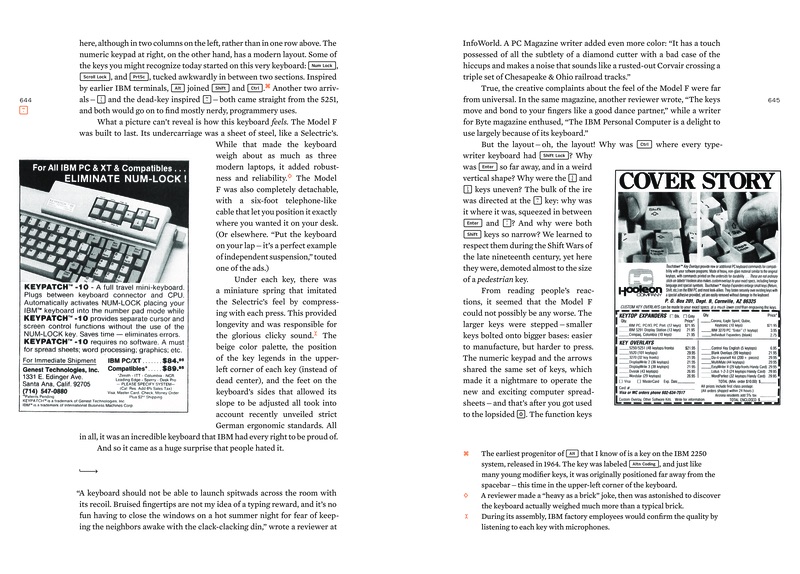
644
This ad foreshadows The KeyPatch 10 accessory on page 704.

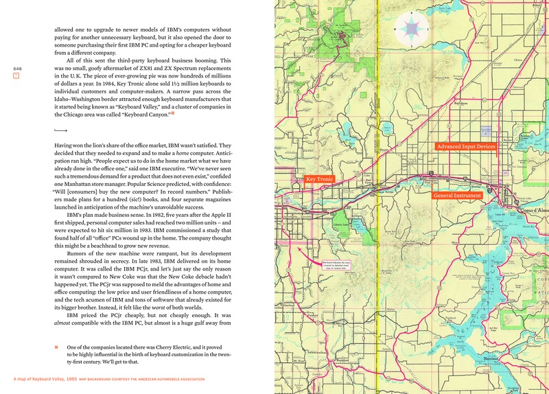
649
This map is supposed to harken back to the much more glorious map on page 68.
654
The photo of IBM PCjr “chiclet” keyboard on this page comes with an
actual pack of Chiclets from the same era.

657
This three-keyboard layout is repeated on pages 836 and 1092.
An alternative view of two of these keyboards can be seen in the extras volume, on page 68.

668
The Model M 122-key keyboard on this page foreshadows the proposed
worst layout described later on pages 1089-1090.

693
This tableau was prepared by myself in a personal DEC museum in Holland. It was important to me
to occasionally surround keyboards with related artifacts, even outside historical photos.
See also: page 510, 517, 654, 655, 669, and 708 (also page 634, but that wasn’t my photo).
694-695
This treatment is meant to match the treatment on page 646.

700
I asked about this joystick on Twitter, and upon learning someone still has it, I solicited a few photos. When the photos came in an incredible resolution, turns out that I got them from a professional astrophotographer.

712
After writing about the previous rare typewriter, I searched for a good photo of it, but after many years, I got nothing. Then, out of a blue, an owner of one reached out to me after reading the said newsletter – and I convinced him to take a photo.


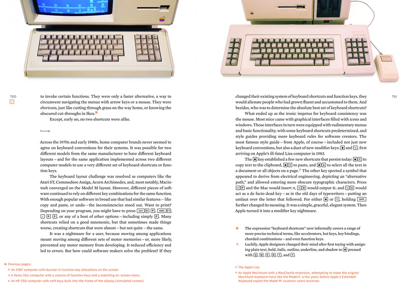
721
The early mentions of the Apple logo key use an earlier version of the Apple logo
(compare with the next page).
726
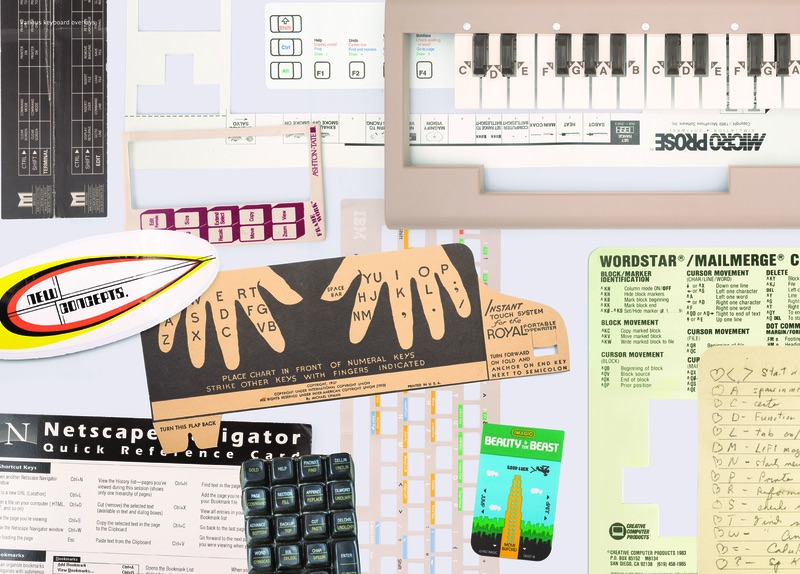
This collage of various overlays includes the keyboard surfboard I wrote about in my newsletter.
729
Throughout the book, the combinations of keys pressed together (like CtrlB)
are not spaced out, but keys typed in sequentially (see the footnote) are.
This is inspired by Jef Raskin’s key combinations treatment in the book
The humane interface.

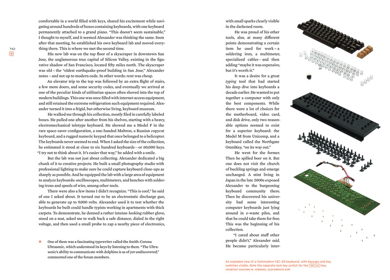
742
This chapter uses N as its patron saint key as a nod to chapter 5
(pages 122 and 135 in particular).
752
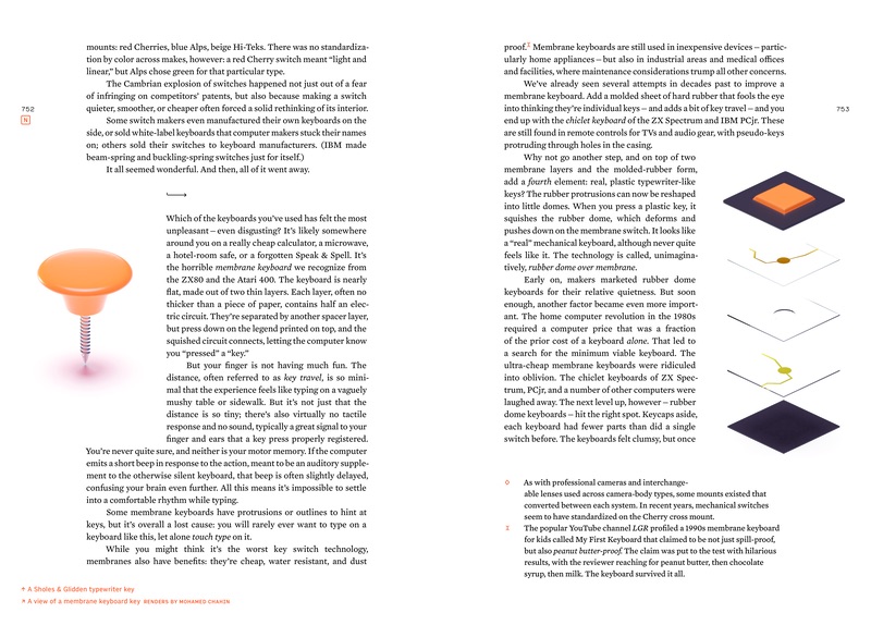
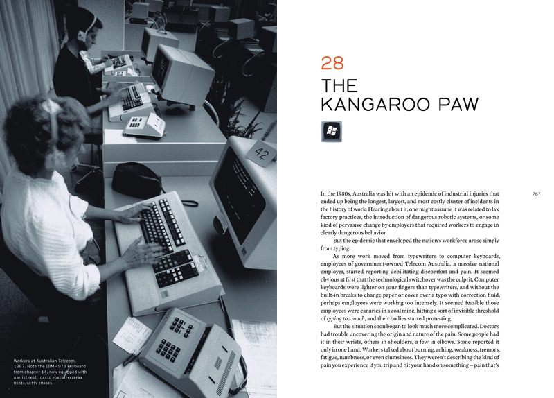
The “switch“ on the left is a kind of a joke going back to early chapters (this is the mechanism from the Sholes & Glidden Typewriter, see pages 27, 38, and 1210), but also showing how different keyboards are today.
766
I wrote about this photo being a late replacement in my newsletter – the original photo here has been promoted to a book cover.
786
I got this keyboard from a friend in Chicago. I transported it all the way to San Francisco, and then I… moved to Chicago with all my keyboards.

795
I found a grainy photo of this rare prototype on an old page preserved by Internet Archive.
I tracked down the owner, who mentioned selling this keyboard to someone else. I eventually found that person
too, but the keyboard was in storage in another continent. Eventually he managed travelliing to reunite to it, taking
the photos for me using visual instructions I gave him that you can see on page 48 in the extras volume.
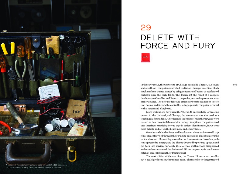
805
The red Esc key on this page foreshadows pages 934-936.
807
Locating a faithful representation of this interace in order to recreate it took a long time.

831
These standards symbols have been redrawn from me to match the other symbols
in the book. (The original standard drawings are, as you can imagine, not very
attractive.)
834
I wrote about this collection in
one of the newsletters (and also in extras volume, on page 24).
869
What’s on the screen is Mavis Beacon, foreshadowing a future chapter.
888
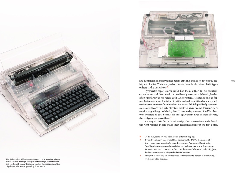
I was trying to find good photos of this typewriter, but the only one I found had high licensing costs. This made me realize that buying an actual used typewriter just to take photos of would actually be cheaper – and it’s a trick I repeated many times.
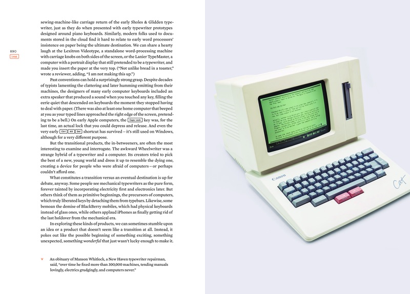
891
I wrote about Canon Cat more in
an early issue of the book’s newsletter. The screen
shows one of Jef Raskin’s memos. See also: extras volume, page 50.
906
For the WASD keys on the margin, had fun imagining a new arrow layout I have
never seen before (also see pages 688-691).

910
Floppy disks shown here are meant to harken back to the vinyl record and the audio cassette on pages 108-9.
912
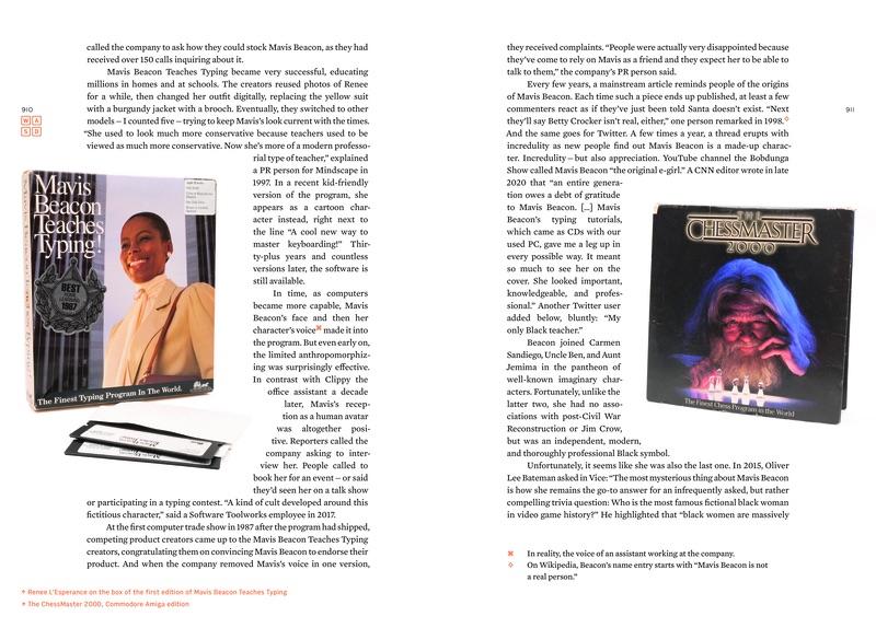
Getting all of these screenshots of Mavis Beacon software required many nights in front of various emulators.

916
The message on the screen harkens back to the common typewriter filler text
“Now is the time for all good men to come to the aid of the party.“

919
Finding a good photo of a cabinet was hard, but luckily, one was volunteered by a reader!


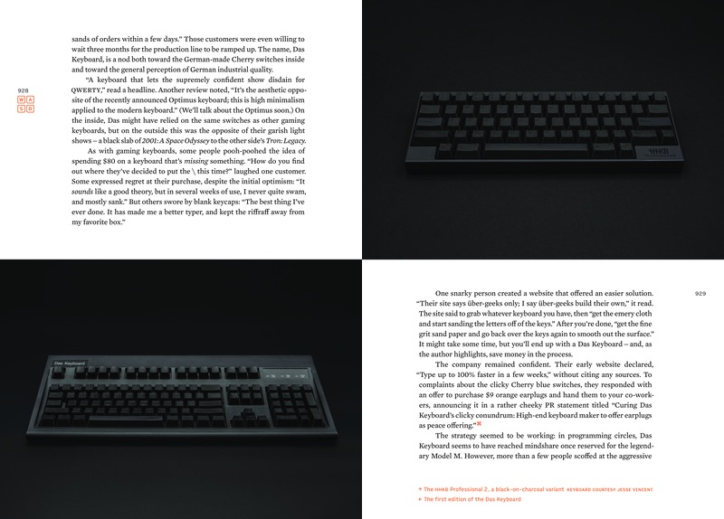
928-9
After many years of searching, this copy of Das Keyboard popped up on eBay just weeks before I had to finish the book. I was very happy I could photograph it using the same treatment as the HHKB keyboard on the same spread.
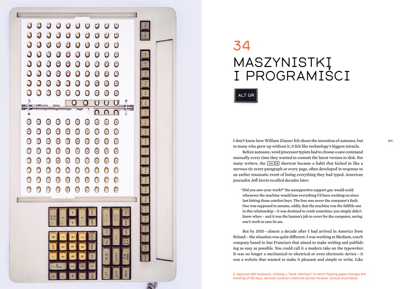
941
The Polish Ś letter is using a comma typed above an S, rather than
using a typographically proper accent. Also, the title of this chapter
is in Polish, and means “typists and programmers.” It harkens back
to the footnote on page 565.
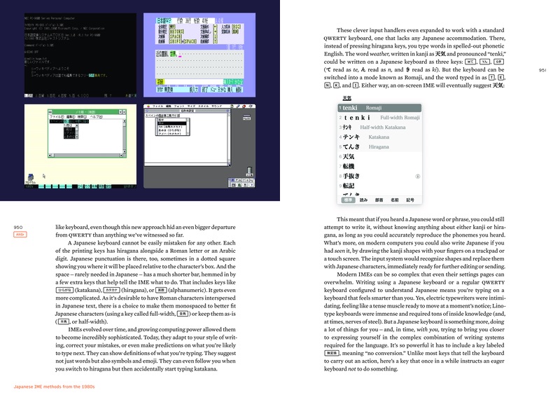
947
I got this photo of a rare Japanese keyboard from someone who photographed it for a museum that never happened. The keyboard has since, unfortunately, been destroyed.

951
The word “tenki” is a nod towards “ten key.”
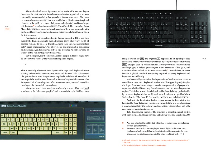
958
Wanted to show this keyboard specifically not just because of the French
layout, but because the right side of the computer shows the codes of
each key.
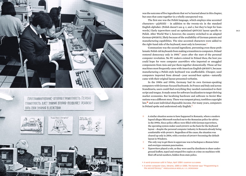
960
Notice the numero next to the page number.

962
While the bottom photo here is available freely on Wikimedia Commons, the top one
was really hard to find.
985
This second keypad page matches the first one on page 239.

986
The message on the screen harkens back to the common typewriter filler text
“Now is the time for all good men to come to the aid of the party.“
988
This is my hand.

992
The message here (“egg freckles”) is an inside joke recalling the infamous Apple Newton
message. (Apple Newton was Magic Cap’s competitor.)

1000
I recreated the screenshot from the Buick Reatta by hand based on multiple photographs.

1002
A rare example in the book of using black-and-white, less-than-realistic photos because other photos were not
available.
1009
One chapter title in the book was chosen so that it contained an ampersand,
which the Gorton font presents in a rather unique shape.

1017
The collection of pins here matches the one on page 115.
1020
I typed this myself on my stenotyping machine. The first example of stenotyping
was chosen so that it should be readable without any explanation.

1029
The onscreen and printed messages here harken back to the story of Mark Twain
on page 77.

1036
The first example of a keyboard using Comic Sans. The rest are on pages 1037,
1108, 1176, and 1177.

1042
The company working on this device actually sent me a physical set of photos
so I could scan them and use them.
1045
This is the only other chapter (see also page 121) that features a stylized
drop cap, as a nod to both of these chapters talking about typography.
1058
This photo showcases the pretty rare electric Royal HE typewriter.
1059
The footnote symbols in this chapter alone are Atari ATASCII semigraphic symbols.
1077
The photo here is meant to mirror the one on page 1058.
1079
The chapter concludes with a specific end mark: the creepy and very memorable
IBM PC smiley.

1083
You can spot my typewriter (introduced on page 157) here.
1116
Erare humanum est has an intentional typo in it.
1118
This layout is meant to match the one on page 56, but mirrored.
1134
This layout is meant to match the one with Tab keys on page 125.

1157
A rare (but important and necessary) example of a dirty keyboard.

1160
I wrote about this toy overlay (and a strange thing I asked it to do) in one of the issues of my newsletter.
1161
A tiny easter egg – a display saying QWERTY on a non-QWERTY device.
1164-1165
This spread is a great example of being able to showing four devices working,
which allows to compare the different flavors of their segmented displays. Also,
easter eggs: the number in the top right corner is the model number of the most
famous Model M keyboard, and the number in the better left corner is the Polish
(mild) swear word when read upside down.

1168
An alternate view/close-up of the TI calculator keyboard can be seen in the extras
volume, on page 69.

1182
The location of this last chapter opening photo is exactly the same
as the one of the first chapter (on page 16). A view of me actually typing
in this location is in the extras volume, page 98.
1183
A fun little easter egg: The title of the last chapter ends with “…please continue.”
1188
The names of people on the screenshots are the name of famous early typewriting speed champions.
1196-1197
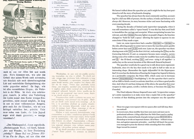
These two pages feature double spaces after full stops.
1198
This spread of wide spacing here is matched by another spread on page 266.
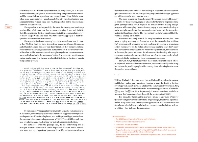
1203
The image caption harkens back to the joke on page 1130.
1208
The label on this photo harkens back to the title of the opening of the book.

1211
The last, bottom-most key appearing in the whole book is the key to
hide the keyboard.

Extras volume
3
I avoided endmarks in the main two volumes, always leaving enough whitespace
so that it was obvious a chapter was ending. However, this was impossible in this
volume, filled with a lot of very short stories.
96-97
The bullet points here are the Atari semigraphic characters from chapter 37.

103
Some of the A–Z keys were bought specifically for the index, and all were
photographed exclusively for this occasion.

155
The index has a lot of fun and easter egg-y entries. An easy one to start with
is looking up my name.
“The day Return became Enter” booklet
Cover
I wrote about the story of the cover and the opening page
in my newsletter.
5
The footnote symbols in the booklet are all different symbols for
Return and Enter keys.
